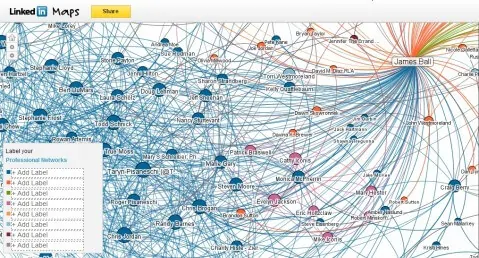
…and I love it! I’m already a huge LinkedIn fan, but this goes a long way towards appeasing the hunter of shiny things in me. LinkedIn Maps is an astounding piece of work and it’s absolutely stunning to behold…and it has some very practical uses. It’s all win in my book. Watch the short video to find out more:
Perhaps today would be a good day to connect with me on LinkedIn, Click the logo…over there in the sidebar —>
Here’s a screen capture of mine:

So what are your thoughts? Will visualizing your network in this way help you to organize and better utilize LinkedIn as a networking tool? Let me know what you think in the comment section.

James- great post.. I am so visual that any tool out that there that takes data and plots it or puts it into shiny pretty colors will have my attention. Then I will hang with it to see what I can get out of it. So now off to Linked In to check this out.
Just a thought> if everyone of your customers in your CRM was Linkedin linked with this visual how long would it take for you to find the connectors in your company and would you really care how much they brought from you, when you can see they have a multiplier effect that is worth more in the long term.
Thank you for commenting Steven, it's always a pleasure when you stop by! "…find the connectors…" – I love it! I really do think that this will be a useful tool to many people, and in many different ways. To your point…thanks for the insight…off to look into that right now!
I played with this for a while last week and loved it, but found no benefit other than the artistic toy. As far as distractions go this is one of the best. I can see it useful in a presentation to explain the 'network' in some way, but I'm not sure how/what. Someone?
I agree with Randy's comment. I think it's fun to play around with the first time and it's a great tool to use in a presentation, but I'm not sure if I see any long term benefit (at least for myself, right now).